Exploring Risk and Reward Across RSI Levels
Welcome back to the third part of our Wealth Wisdom series! In the previous articles in this segment, we have explored the upsides and the downsides associated with the Relative Strength Index (RSI), one of the most popular technical indicators. In particular, we had dived deeper to validate or test the proposition that a stock is oversold when RSI is below 30, and and is overbought when RSI is above 70. We have analyzed 14 lakh data points spanning 15 years of data of 500 stocks and are excited to share the results with you!
Today, we will take the results of the upside impact presented in the first post, and the downside impact presented in the second post, to present a complete picture of the net impact, balancing risk and reward, across the entire range of RSI values, over so many years.
Re-cap: Upside and Downside Impact of RSI
Here is a very quick re-cap of the previous two posts, and in case you want to follow the RSI analysis series from the beginning, you can head over to the post on the upside potential, followed by an analysis of the downside risks.
In a nutshell, we found that historically there has been more upside over the next 10 trading days, whenever the RSI is at high levels. We have witnessed potential for greater upside even when RSI is at low levels. This dispels the notion of a universal rule, claiming that stocks are overbought and oversold at certain points on the RSI spectrum.
We found similar patterns when analyzing the potential downside of stocks over the next 10 trading days across all levels of RSI. We found that the downside is much more pronounced when the RSI is either low or high.
It is a matter of great responsibility to test the classical theories around RSI that have traditionally been assumed to be true, ever since these were published in the 1970s. Hence, we left no stone unturned in our analysis, reviewing 14 lakh data points across almost 15 years and covering 500 stocks that are currently part of the NSE-500. With the upside and downside review providing signals that are conflicting with the classical theories, let us now review the net impact, balancing risk and rewards.
Net Upside Across The RSI Spectrum
There are two alternate methods that we have adopted to analyze the net upside, or the risk adjusted rewards, of stocks across all levels of RSI. Let’s first follow the simpler additive approach, where we simply add the net upside of stocks over the next 10 days and (negative value of) the downside over the same period.
Net Upside By RSI Levels
Before you look at the chart below, take a minute to understand the benchmark, or the reference values. The average value of Net Upside across the entire universe or our analysis is 1.70%. In other words, the average difference between the 10-day upside and the 10-day downside over almost 15 years across 500 stocks is approximately 1.70%.
Now, let us examine the Net Upside when the RSI is in different bands between 0-100 in the chart below.
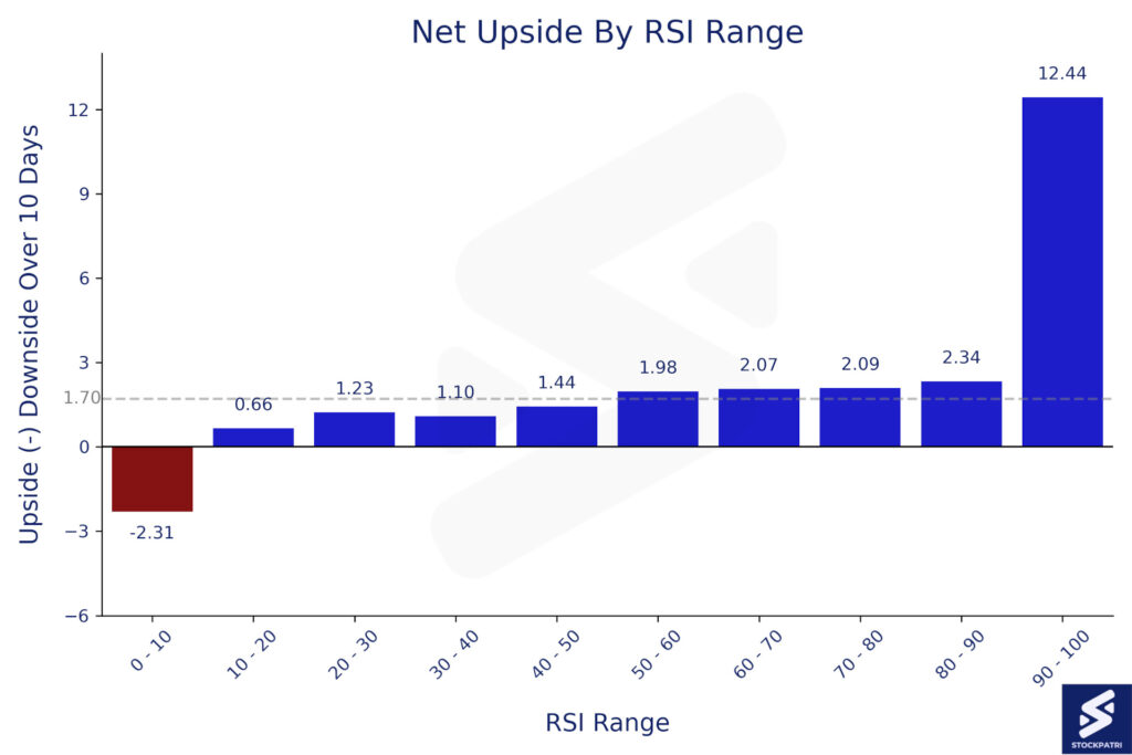
As they say, a picture speaks a thousand words. And, in this case, the picture reveals much more! The net upside is much lower than average when the RSI is below 30. This flies in the face of conventional wisdom that asserts that stocks are oversold when RSI is below 30. The average Net Upside when RSI is below 30 is 1.14%, which is significantly lower than the reference value of 1.70%.
The net upside is even more interesting when RSI is above 70. As per classical theories, the stock tends to be overbought at these levels. However, our analysis shows that the net upside when RSI is more than 70 is 2.21%, which is higher than the average of 1.70%.
In other words, when RSI is supposedly ‘overbought’ at levels above 70, the net upside of stocks is almost twice , as compared to the period when the stocks are claimed to be ‘oversold’ at RSI levels of less than 30.
What values of RSI demonstrate more Net Upside?
As one can see from the chart, stocks tend to demonstrate a greater than average net upside potential when the RSI is more than 50. This is also something that the classical theories have always maintained. A stock tends to be bullish above RSI of 50, and bearish below an RSI of 50.
If you look under the hood of how the RSI is calculated, and correlate it with price movements in the market, you will see why the above analysis makes logical and intuitive sense as well. We can dive into that in a separate post of Wealth Wisdom, but for now, let us show you the results from the second approach of evaluating the combination of upside and downside potential, i.e. risk and reward.
Balancing Risk and Reward Using RSI
In the second approach, we will assess the upside and downside as a ratio of reward to risk. The higher this ratio, the better it is for traders and investors, since we are generating higher returns for each percentage of downside risk. Even though this ratio is not the standard manner in which risk is computed in the financial services industry, most traders will immediately recognize that this ratio mirrors the concept of ‘take profit’ and ‘stop loss’.
The average reward to risk ratio across all 14 lakh data points is 1.32. In other words, if we divide the 10 day upside potential with the 10 day downside potential across the entire duration, the result is a ratio of 1.32. Now, let us look at the chart below, and examine how this ratio changes across the entire spectrum of RSI values.
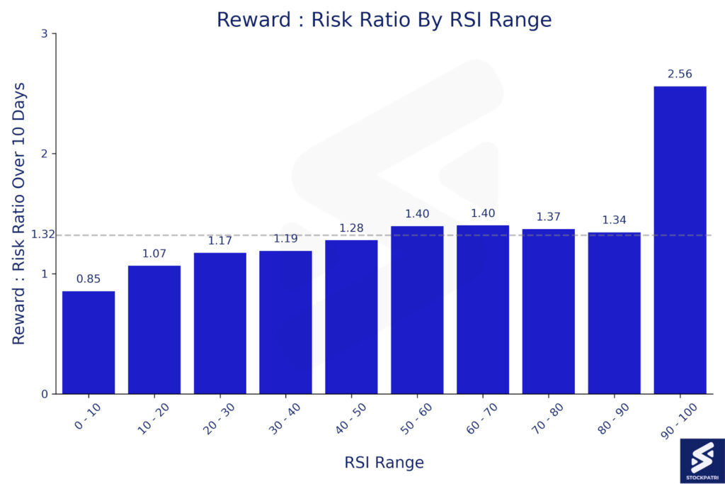
As one can see from the chart above, the risk-reward equation is unfavorable when RSI is below 50 compared to the average. For the numerically inclined, the ratio of upside to downside (or reward to risk) moves up from 1.15 when RSI is below 30 to 1.38 when RSI is above 70. As traders who enter trades with a typical target ratio of 2:1 for profit vs stop loss will testify, the difference between a starting point of 1.15 and 1.38 is significant, even though it is not enough on it’s own to warrant taking a position.
How to use RSI Levels while investing and trading in the stock market?
As you may have heard several times, there is no single indicator or strategy that can act as a silver bullet in your efforts to second guess the market. The purpose of this post, and other posts in the Wealth Wisdom series are not to provide you with financial or trading or investment advice.
We are publishing the results of our analysis of the price movements of the broader markets over an extended duration, so that there is irrefutable evidence of what the past data and history tell us. The past patterns can at best, serve as guidelines for the future. However, the past performance can not, by itself, predict the future prospects.
One should also bear in mind that the RSI is just one lens through which we can view the past performance. In practice, one needs to review the past and look at the future through multiple such lenses.
Today, we have been successful in brining clarity to the lens of classical RSI based theories that a lot of people were wearing. Since the market has not behaved in accordance with these theories, it is only fair to conclude that these lenses were causing blurry vision of the markets.
Finding an oversold or overbought level, or developing an investment or trading strategy, is far more nuanced than merely looking at the RSI levels, or any other indicator or metric. Consult your financial advisor for guidance on the right tools and metrics, and while you are at it, also ask them for their views on this Wealth Wisdom series, and our proprietary Stock Bal Index. This is probably India’s first ever measure of the relative strength of all stocks traded on NSE across three different time frames, published in a single consolidated dashboard at the end of each day on StockPatri.
What about mean reversion?
Some of you may have a question about the theory of mean reversion. Stocks being overbought and oversold at certain RSI levels are only one of the many tools and theories to identify such reversal points. As we have seen from the above analysis over extensive data spanning 14 lakh data points for 500 stocks over 15 years, the past performance does not support this classical theory of RSI levels in itself helping us identify reversal points.
One needs to keep digging deeper, and trusting data and scientific and statistical analysis, in our bid to understand the science of financial markets and investing. This is the core approach that we follow at StockPatri, where we endeavour to bring to you data-driven insights, that have so far been available only with institutional investors, or with those who have disproportionate access to resources.
Final Thoughts
As we wrap up this exploration of net upside and reward-to-risk ratios based on RSI levels, we encourage you to incorporate more fact-based and data-driven insights as part of your broader investment and trading strategy. Remember that seasoned investors don’t rely on one indicator alone; they evaluate multiple factors to make informed decisions.
Stay curious and engaged as we continue to unravel more insights in the upcoming parts of our Wealth Wisdom series! If you found this article helpful or know someone who could benefit from it, please share it within your network.
Until next time, happy investing, and stay in touch by signing up to our newsletter. May you keep taking steps to re-write the patri of your finances with StockPatri, and beyond!
Disclaimer: Stock market investments are subject to market risks. Past performance is not indicative of future results. The above should not be treated as investment advice. Please read the full disclaimers here.